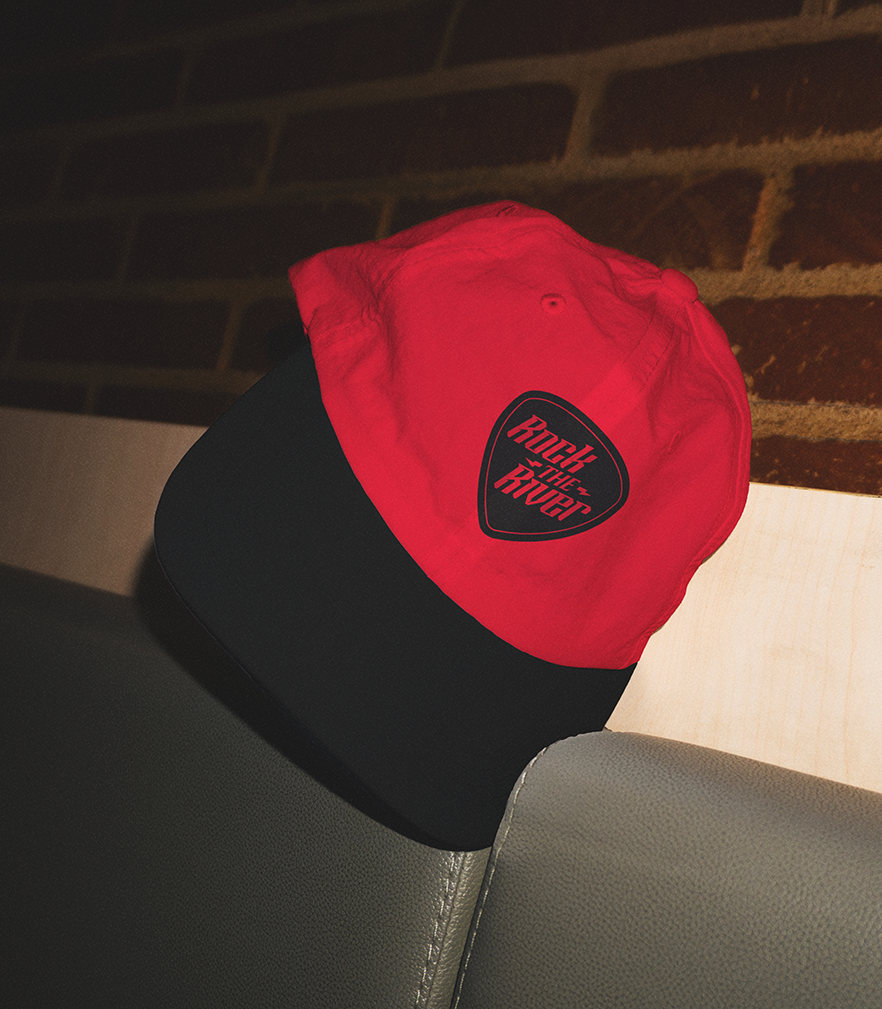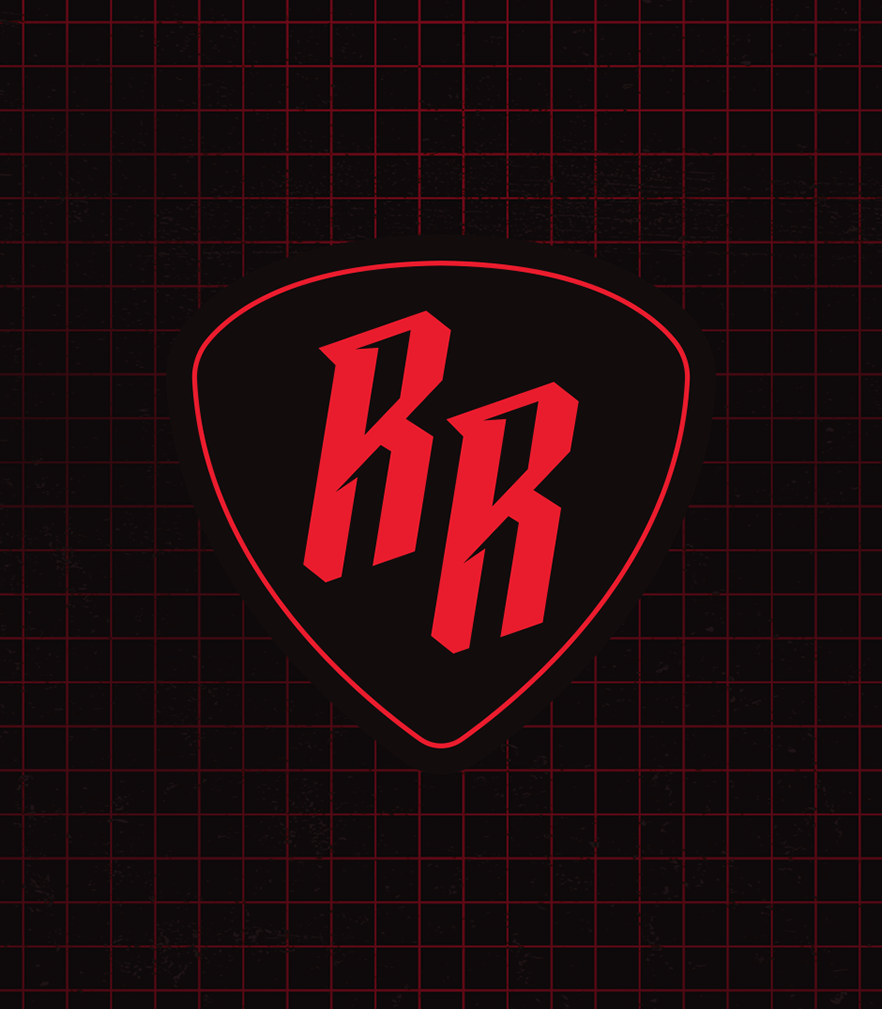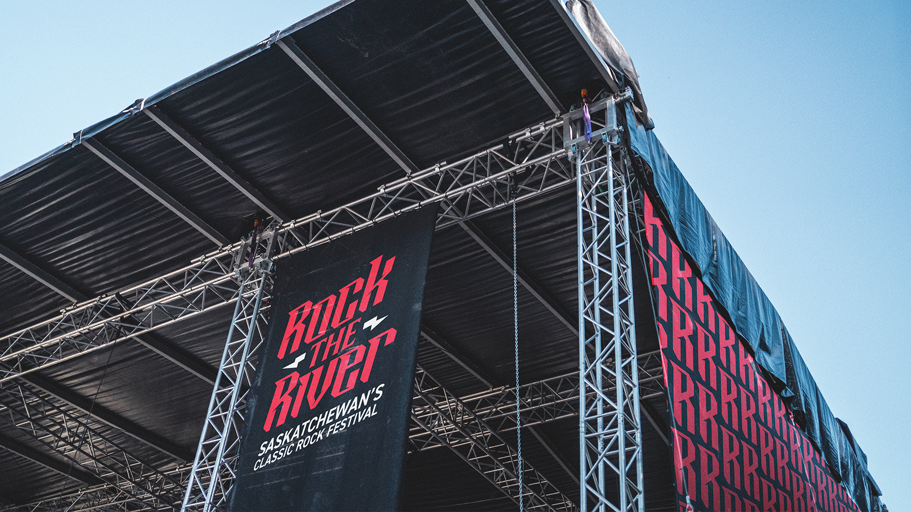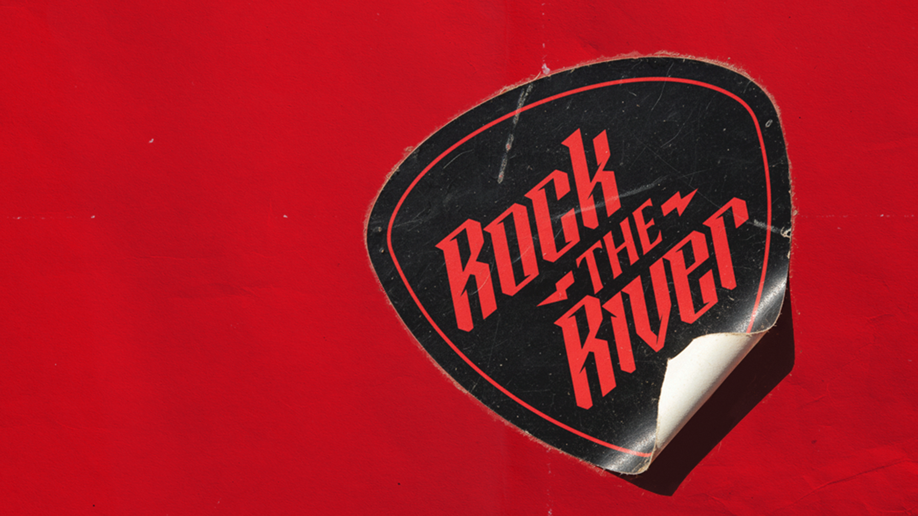
Rock the river logo development
Rock the River is a Saskatchewan-based rock music festival that brings together a wide spectrum of artists and fans across multiple rock subgenres. Our task was to evolve the existing identity, grounding it in the roots of rock while pushing it into a more modern space. The logo draws from classic rock iconography, with sharp, angular typography and a bold badge form that nods to vintage concert culture, while feeling clean and current in execution. It was important that the mark could resonate across generations, delivering a sense of nostalgia for longtime fans while carrying enough edge to attract a new wave of rockers.